We'll cover five best practices for graphic designers as they transition between screen and paper in order to optimize final color quality and accuracy.
It’s a classic, often frightening, tale in the world of print and graphic design: You’ve spent an enormous amount of effort into a design project — why doesn’t your finished product match what you’re seeing on the screen?
Print technology has evolved tremendously in a relatively short amount of time. The advent of digital print devices has created the capability to do more with less than ever before. But at the same time, a considerable knowledge gap still exists between graphic designers utilizing RGB input at the start line of the design process, and the necessity of CMYK output at the finish.
How does one bridge that gap?
Matching colors can be tricky. Sure, it'd be easy if you were printing on the same stock, from the same computer, using the same inks, with the same equipment, under the same conditions. But you're not. The reality is there isn't always a simple recipe for color matching precisely from monitor to final print.
However, I've outlined several best practices below so that as you work through the design and print process, you can better understand the methodology behind the color matching game.
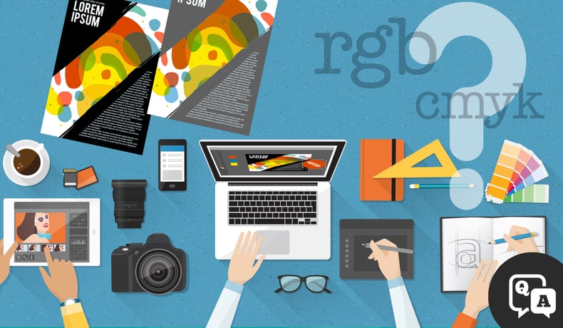
Before we begin: What's RGB? CMYK? What’s the difference?
RGB (Red, Green, Blue) and CMYK (Cyan, Magenta, Yellow, Black) are the two common, relevant color models you're accustomed to. A color model is a numerical system for describing color, using three or four main numbers to represent primary colors. The RGB color model is an additive color model, meaning that the more RGB light beams emitted, the closer you get to white. The CMYK color model is a subtractive color model, meaning that the more ink is added, the closer you get to black.
Where (and how) are they all utilized?
Scanners, digital cameras and computer monitors, for example, use the RGB model, while commercial printing devices print under the CMYK model. All that is to say, all color models can only display a specific range (or gamut) of colors that don't always overlap. So how do you navigate those spaces and end up with a product that ultimately matches?
5 Best Practices for ensuring your print output and the colors on your monitor match as closely as possible:
1. Start with final output in mind.
This is simply a matter of "seeing" beyond what's presently on your screen. As mentioned above, a color model attaches specific numbers to colors. It's very important that you know your numbers in each workable color space to ensure they transfer accurately for all applications. Otherwise, adjustments made become a visual guessing game.
2. Calibrate your monitor.
Color specifications can vary greatly from application to application. What you’re seeing in Photoshop could be drastically different than Illustrator based on certain parameters. When you’re working within these applications, you need to understand the spaces you’re working with, and calibration can help you sustain consistency between them.
Not seeing what you expect? The application color settings may simply be inconsistent. You can learn more here about Adobe-specific color management and monitor profile and calibration.

3. Don’t forget to preflight.
Before you take off, we need to do some checks.
Preflighting is the process of checking if the digital data required to print a job are all present, valid, and acceptable to your standards. Think of it as a troubleshooting stage in the process. Remember, you’re dealing with different color spaces for different applications. The preflight process allows us to check: Are there RGB and CMYK colors in the document? All RGB? All CMYK? And then — do we have the appropriate output profiles selected to make sure our colors are consistent and accurate?
When we transition from RGB to CMYK, what changes will we create for ourselves? Are any changes acceptable to you or your client? Pre-flighting will help you further evaluate, and correct, that question.
Document preparation software, such as Canon's PrismaPrepare, can certainly streamline
document makeready from composition through print production (including color management). Its integrated color management capabilities let you replace, change, or modify colors, so you know right on screen how the final product will appear.
4. Check your engine(s).
To make sure your engine (print device) is capable of producing what you prepared, it needs to be fine-tuned regularly. Engine calibration should be a regular routine to make sure specs you’ve created are staying in tact. I.e., if you print the same brochure a year from now, there will be no color variance.
Remember, even with regular calibrations, colors can shift from device to device, making G7 Color Calibration methodology a reliable standard for preventing inconsistencies and unexpected results. For some devices, it’s inherent in them to have regular G7 quality checks (read more about G7 here).
In these, you can even create reports and share those reports on engine profiling on a daily basis.
5. Don’t hesitate to seek expertise.
It’s OK to ask for help.
If you continue to have issues with managing output, seek the consultation of an expert who’s gone through specific color management and/or G7 training. Often, it’s not an issue of having the most information, but rather the latest information. A trusted consultant will know the latest in output management specific to your print device and your print environment.
One Final Point: Design with your end-goal in mind. And consider speaking to a G7 Expert.
Years ago, I experienced similar color frustrations while serving in the ministry. Tasked with putting together a weekly worship guide, a magazine, and annual yearbook, we had to at times fumble our way through shifting colors. Eventually, we learned that we needed to shift our thinking to include output management.
If you know a certain design has a digital-only application, take that into consideration. If you know you’ll be printing it, consider the varying elements that will exist (as outlined above) as you move from screen to paper. Always ask yourself: What's the end-goal with this project?
A G7 Certified Professional has demonstrated expertise in the field of color management, process and quality control for proofing and printing utilizing the G7 methodology (which is undoubtedly today's standard in production print). If interested in this consultation, we're happy to help you find one near you. Click here for the full G7 Expert Directory.
Print is not dying. It’s different. It’s diversifying. Are you ready to capitalize on the valuable impressions that can be created through print? Are you ready to make your creative vision come to life on paper? Consider a production print assessment with Datamax!