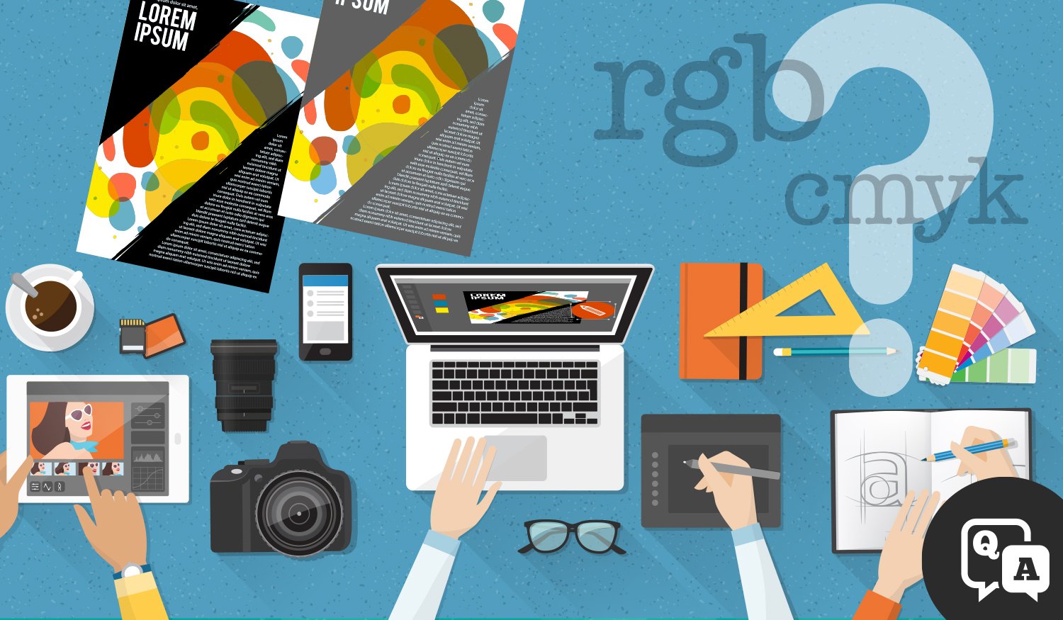
We'll cover five best practices for graphic designers as they transition between screen and paper in order to optimize final color quality and accuracy.
It’s a classic, often frightening, tale in the world of print and graphic design: You’ve spent an enormous amount of effort into a design project — why doesn’t your finished product match what you’re seeing on the screen?
Print technology has evolved tremendously in a relatively short amount of time. The advent of digital print devices has created the capability to do more with less than ever before. But at the same time, a considerable knowledge gap still exists between graphic designers utilizing RGB input at the start line of the design process, and the necessity of CMYK output at the finish.
How does one bridge that gap?


