
Printing in color can improve the action you want taken on the documents you use for business.
In Western culture, white symbolizes “purity” and “cleanliness” (or taken to extremes, “sterility” or “coldness”), while in traditional China white is the color of mourning. Black cats are seen as a sign of bad luck or a bad omen in the West; but are a symbol of good luck in Japan and most of England. Color has meaning (and, yes, the color scheme in McDonald’s is designed to get you to eat more!).
When it comes to communicating with your office documents, a little color can make a big difference. Consider these two statistics:
- Institute for Color Research – up to 90% of subconscious judgements about a person, environment, or time are based on color alone.
- CAP Ventures (From 2008/9) – full color variable documents enhanced customer loyalty and retention, generating 34% faster response rates, a 48% increase in repeat orders, and a 32% increase in overall revenues.
So not only does color have meaning, it also matters. How can you take advantage of color? Do you have a color copier or color printer? Then you have the ability to print in color. Here are a few ways to maximize printing color documents.
Invoices
Use color to draw attention to the amount due by something as simple as a colored box around the amount. It’s also useful to do the same around the “due by” date too. For past-due invoices, you can take this one step further and even print your invoice on colored paper. The shift from plain old white to an entirely differently colored paper is often enough to cause someone to notice – and then act.
Creating a colored background in Microsoft Word is simple:
- Click on “Page Layout”
- Then click on “Page Color,” select your color from the pop-up box and you now have a color background to your document.
Keep in mind that printing many documents with a colored background could exhaust your ink supply quickly, so use sparingly in print (or buy colored paper) or only use for electronic communications. The most important element is always readability, so be sure that the document is still easily read.
Avoid Pale Blue
As we age, our eyes begin to play (even more) tricks on us and one of the first things to go (color-wise) is a decrease in the ability to see pale blue. When choosing fonts or accent colors, be kind to older eyes and don’t use this color.
Color “Walk Through”
Biologically, our eyes are designed to catch movement and to notice the exceptions. Use this to your advantage when designing a document. An element of color in section headings, tables, and important points in your document can be used to guide the reader through to the elements that are most important. This article, How to Use Color in Business Proposals, has a good run-down of what various colors “say” about you.
Contrast
Be sure to use contrasting colors to enhance readability when printing color documents. White text on a yellow background is very hard to read. Black text on a white background is a good contrast – equal that level of readability when using color.
Sales-Generating Messages
Use color to draw attention to a marketing message – a discount offer to customers or an upcoming event, for example – at the end of a customer-facing document.
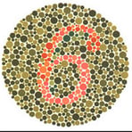 Remember that not everyone sees color. Remember those eye tests from grade school – the ones with the colored dots and a number? Some people do see a different number, so be sure that color is used to supplement and reinforce, but that the document remains readable and makes sense regardless.
Printing in color can improve the action you want taken on the documents you use for business. Isn’t it time for you add a little more color in your life?